Connectd
2024 · Lead product designer
Why do founders leave so soon after signing up?
I interviewed every investor, 20 advisors and 34 founders, then convinced the founder to drop investors altogether.
Raised $7M after the redesign
Alongside my work, I research curiosity, creativity and courage, and what makes human and AI collaboration better through trust and confidence.
Why do founders leave so soon after signing up?
I interviewed every investor, 20 advisors and 34 founders, then convinced the founder to drop investors altogether.
Raised $7M after the redesign

What makes a cosmetic treatment journey genuinely safe?
Studied patient journeys that went wrong and designed safety into the service itself.
3,000 transacting users
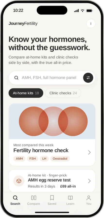
How do women make life-shaping fertility decisions with so little information?
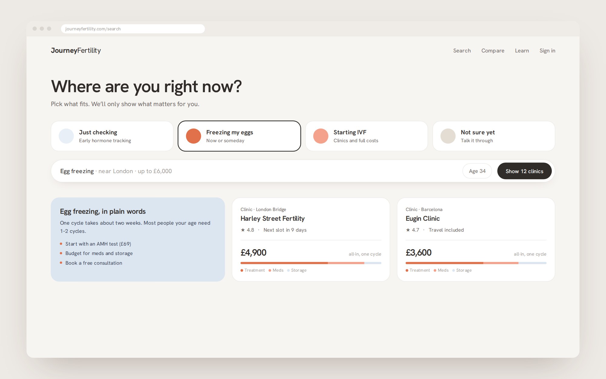
53 interviews with women going through IVF and planning to freeze eggs or embryos shaped a search that starts with "where are you right now?"
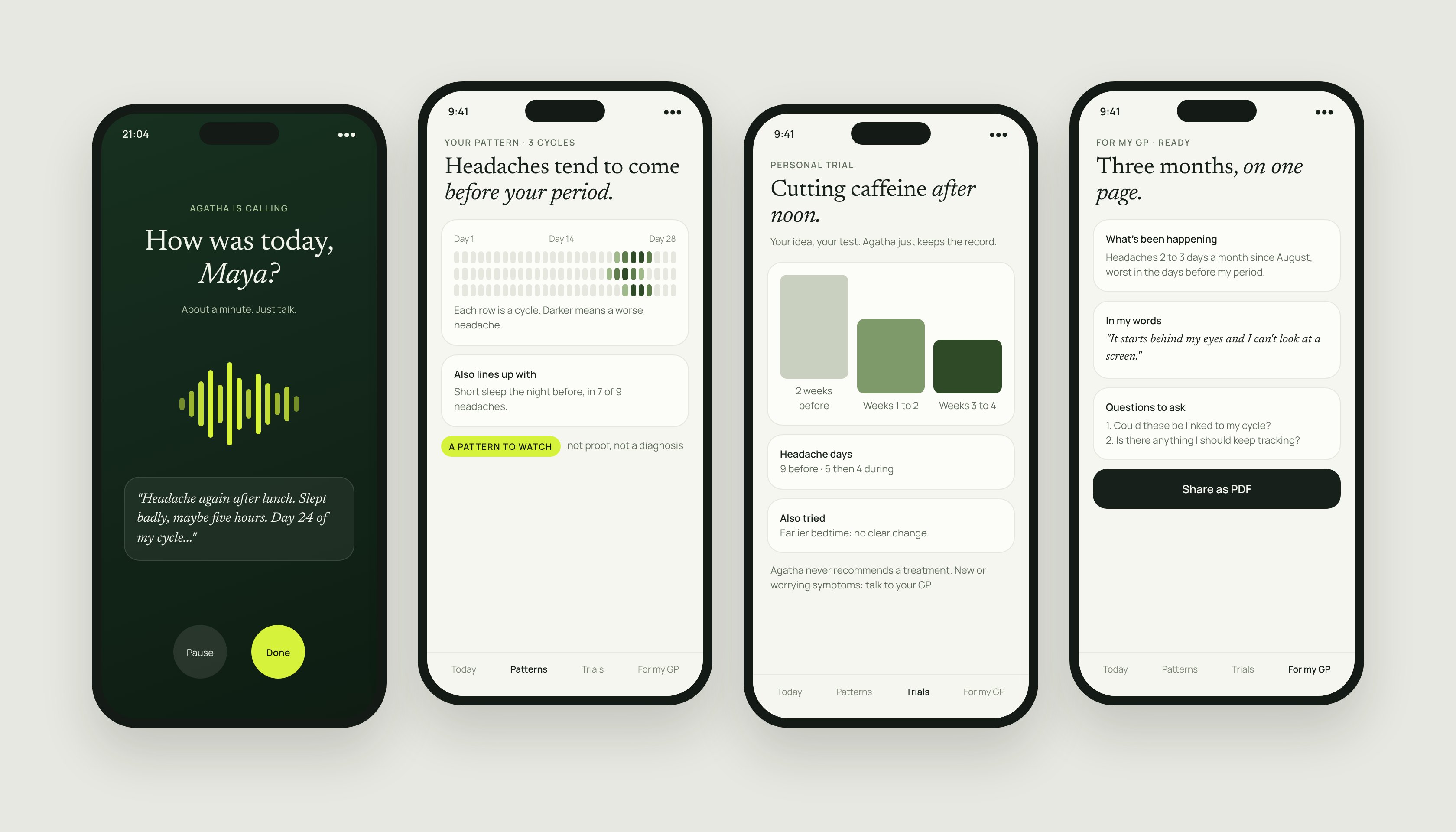
Why do real health patterns go unseen for years?
A one-minute voice log that turns a woman's own days into a timeline she can take to her GP.
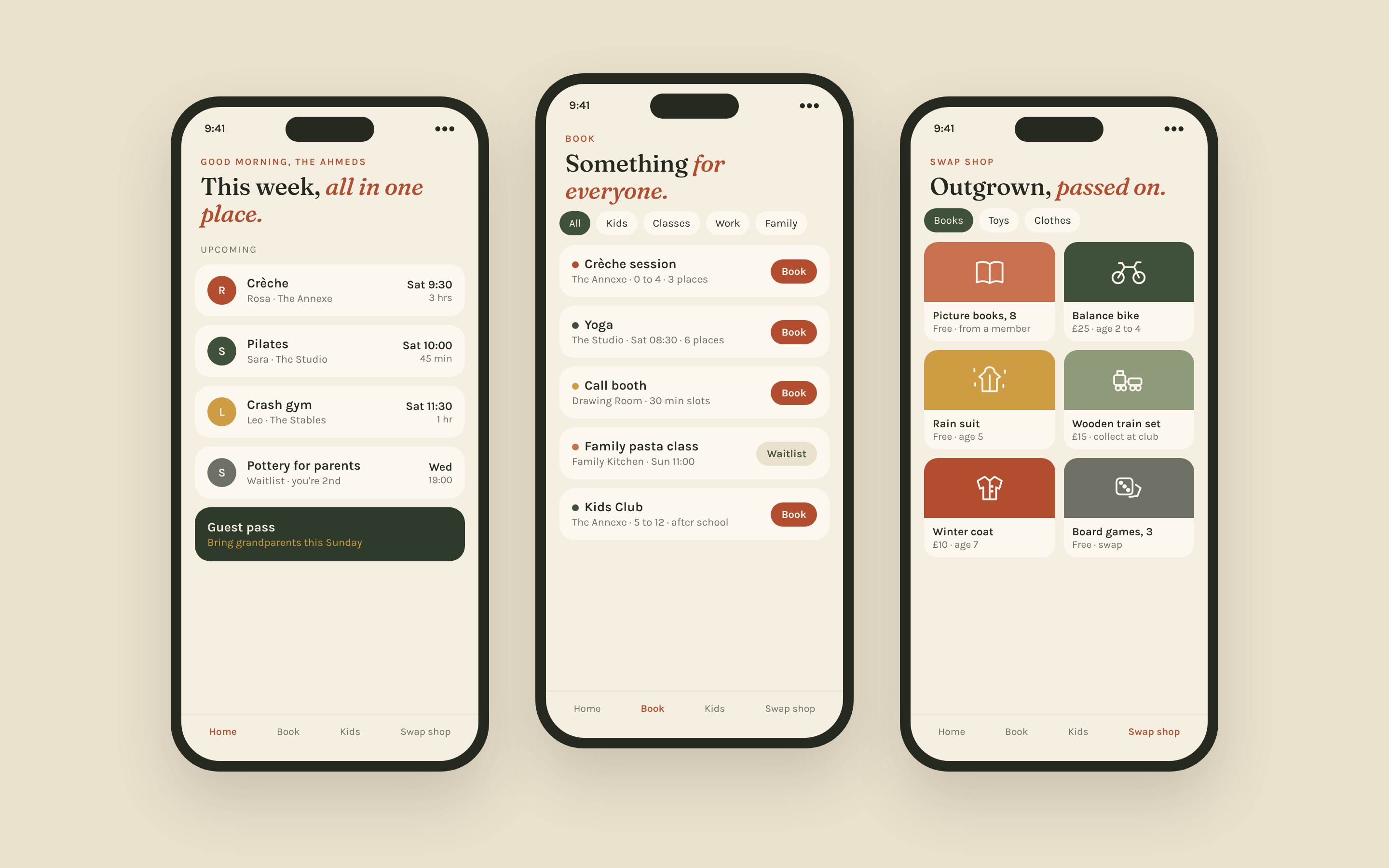
What would a members' club look like if families designed it with us?
A family members' club in Chesham Old Town, shaped with its first 100 founding families.
100 of 100 founding places claimed
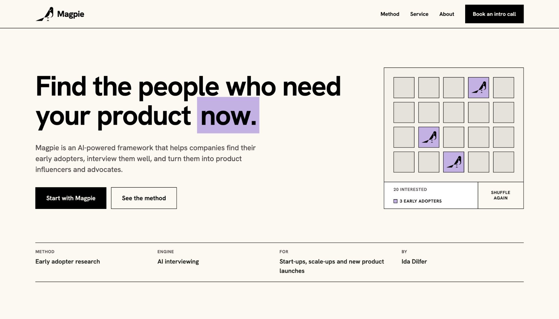
How do you interview early adopters at scale, and well?
An AI-powered framework that finds a product's early adopters, interviews them and turns them into advocates.
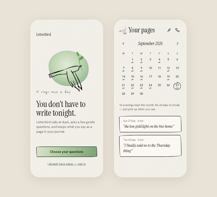
Why do most people give up journaling within a week?
70% daily active, 1,000 invite-only users
A voice journal that rings once a day, asks a few gentle questions and keeps what you say as a page.
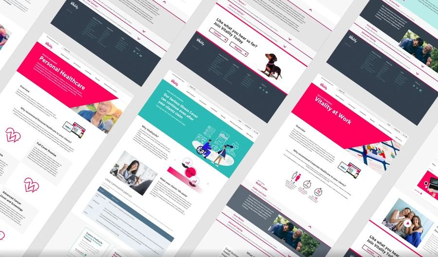
Vitality, Pension Buddy, The Cambridge · 2020 to 2023 · Design systems and WCAG 2.1 AA accessibility for health and finance platforms used by millions
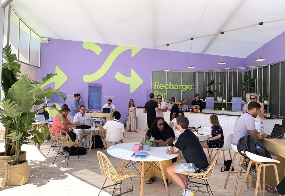
Facebook, Spotify, IBM, Mazda · 2018 to 2019 · Installations and interactive experiences at Davos, Cannes Lions and NRF
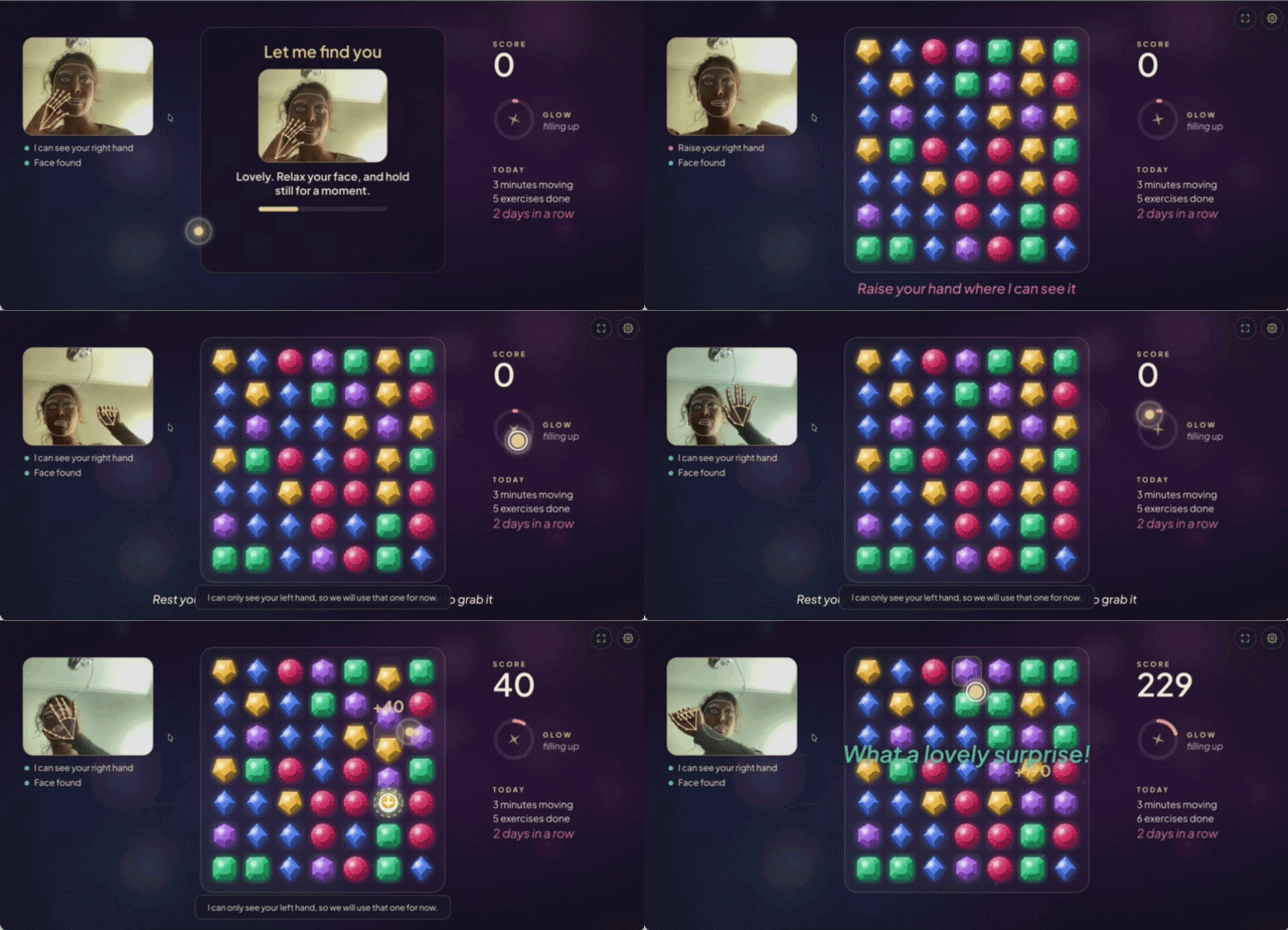
A game for Mum.
My mum has Parkinson's. I designed this from close observation of her daily exercises. Hand and face tracking turn them into play: open your hand over a gem, then close it to grab. Research with a sample of one, for someone at the edge of the data.
Curiosity, creativity and courage.
How do people find the courage to move forward when the odds, the statistics and the people around them say they won't? Talent isn't a fixed gift; environment shapes what people achieve. This ongoing research shapes how I listen, and how I design for people on the edges of the data.
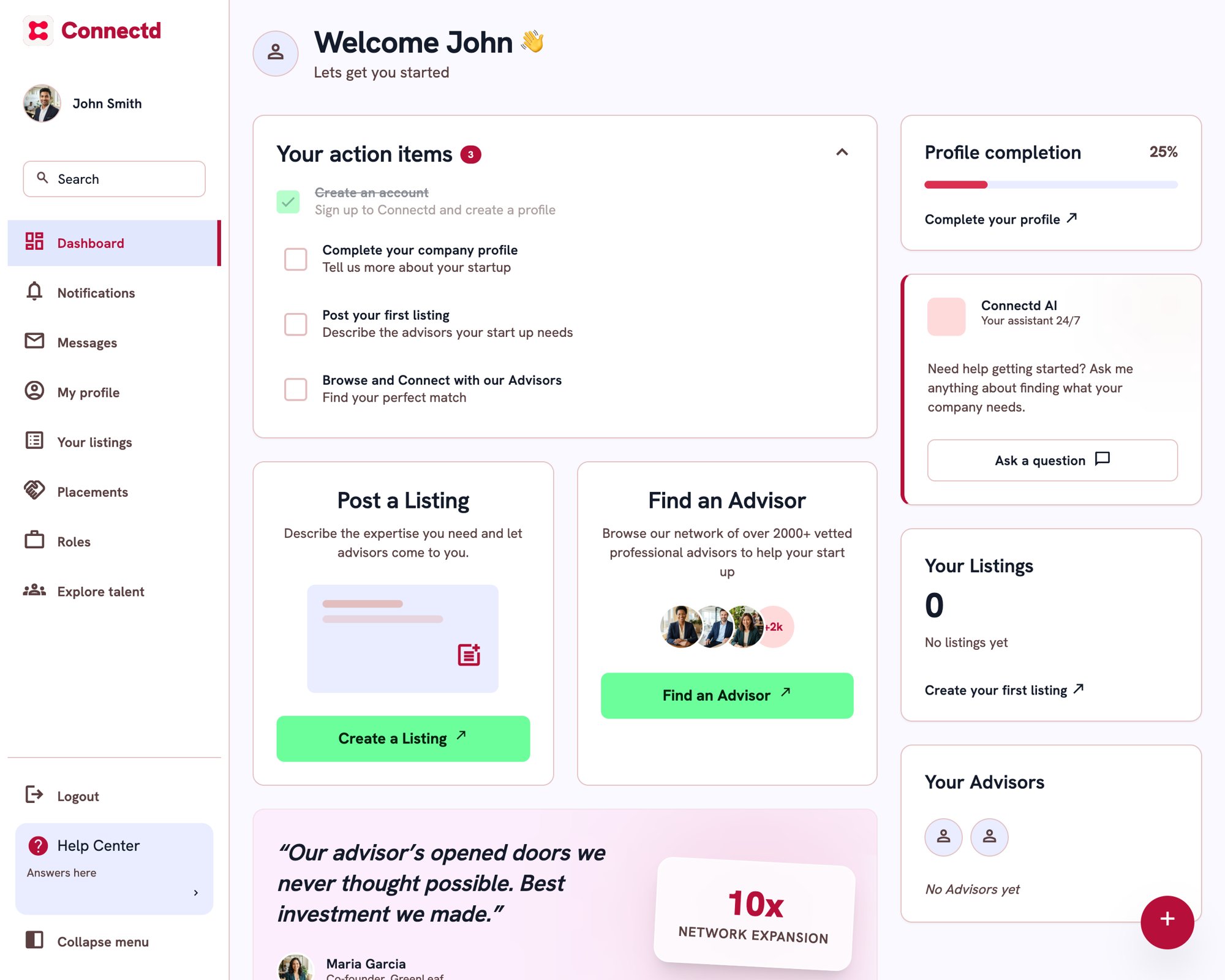
A marketplace matching startups with advisors and fractional leaders. Founders were signing up, then leaving.
raised by Connectd in July 2025, after the redesign, in a round led by AnkerSource: Vestbee
interviews across investors, advisors and founders
Connectd served three groups: startups, advisors and investors. Founders signed up, then left soon after.
I interviewed every investor on the platform, 20 advisors and 34 founders, to find out why.
I convinced the founder to drop investors and focus on startups and advisors. Then I designed founder education and advisor education, so both sides understood the value from the first screen.
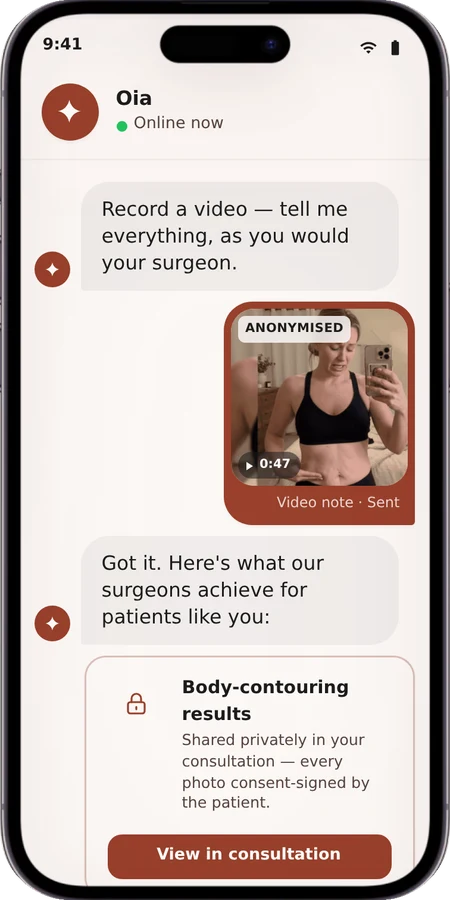
Every new founder starts with three clear actionsPeople planning a cosmetic treatment spend weeks lost in research they can't judge. I set out to understand where those journeys go wrong, then designed a service where an AI concierge, Oia, carries the patient safely from first question to recovery.
users who have transacted with OiaSource: Oia platform data, November 2026
patients and surgeons interviewed and iterated with
now expanding from cosmetic treatments into longevityheyoia.com
Planning a cosmetic treatment means comparing clinics across countries, prices that hide extras, and before and after photos nobody can verify. When it goes wrong, it really matters: the wrong treatment, the wrong surgeon, or no one looking after you once you fly home.
I spoke with more than 30 patients and surgeons, from people considering treatment to people recovering from it, and mapped the journey from first search to full recovery to see where trust breaks.
Make the conversation the whole product. Oia starts from the person's concern, matches on verified results rather than paid placement, explains every match, and never makes a medical call. A person reviews every shortlist.
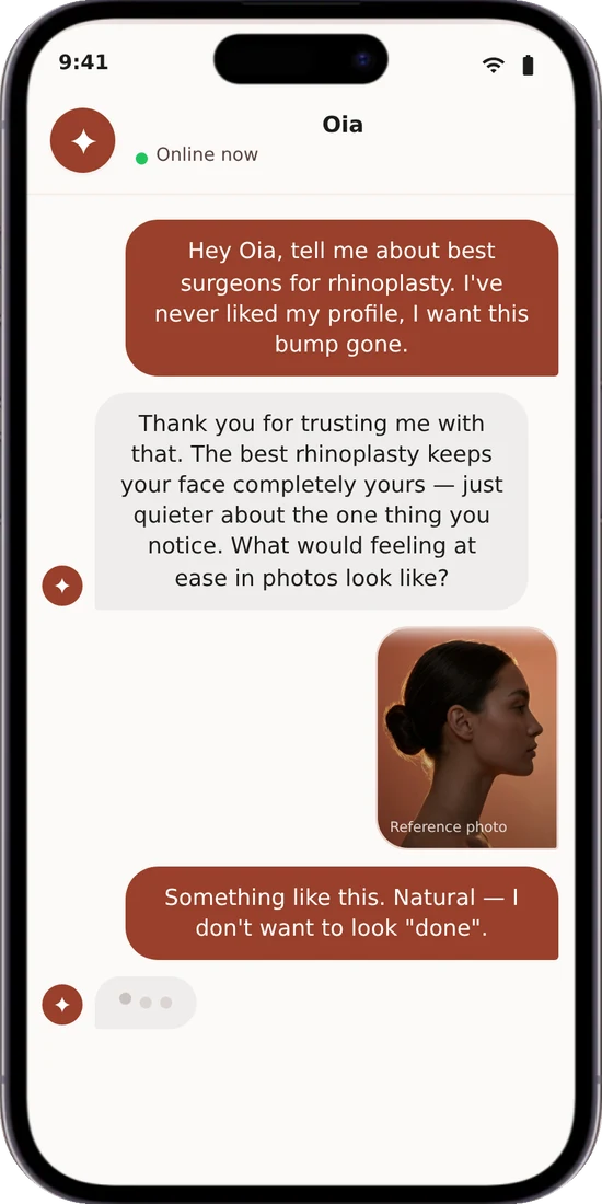
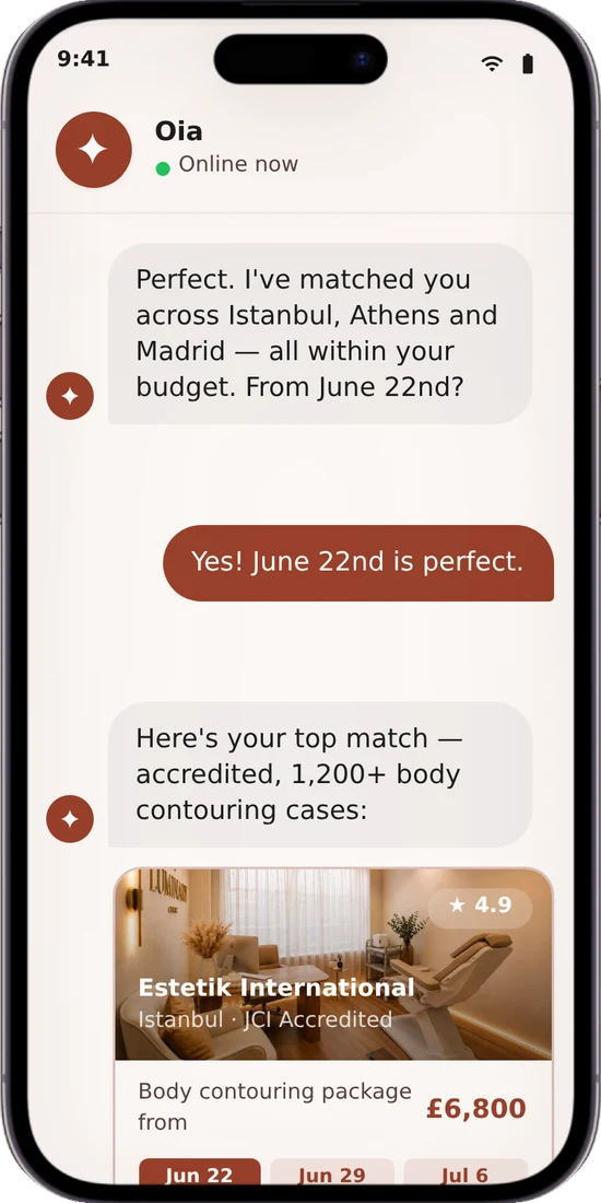
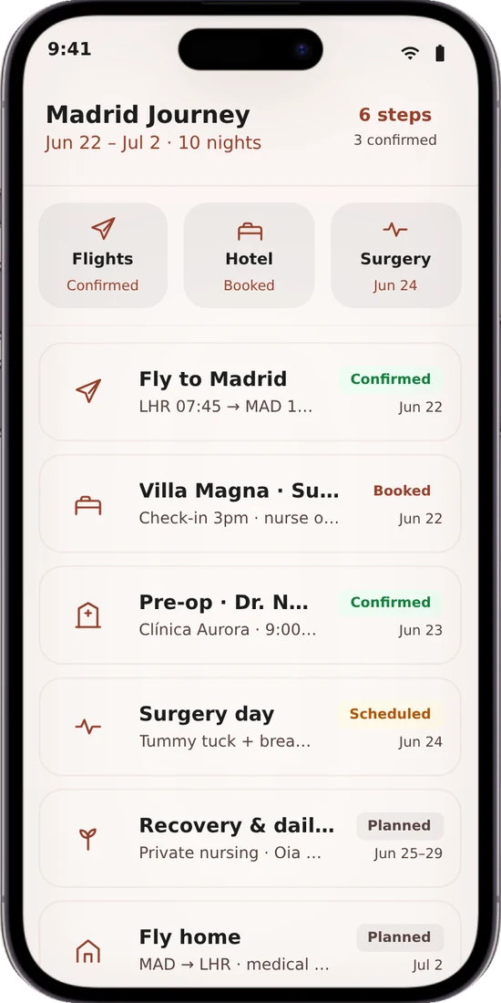
I designed the screens first and fitted Oia's words in afterwards, and it felt bolted on. For an AI agent, the dialogue is the design. Now I script the conversation first and treat Oia's voice and limits like a design system.
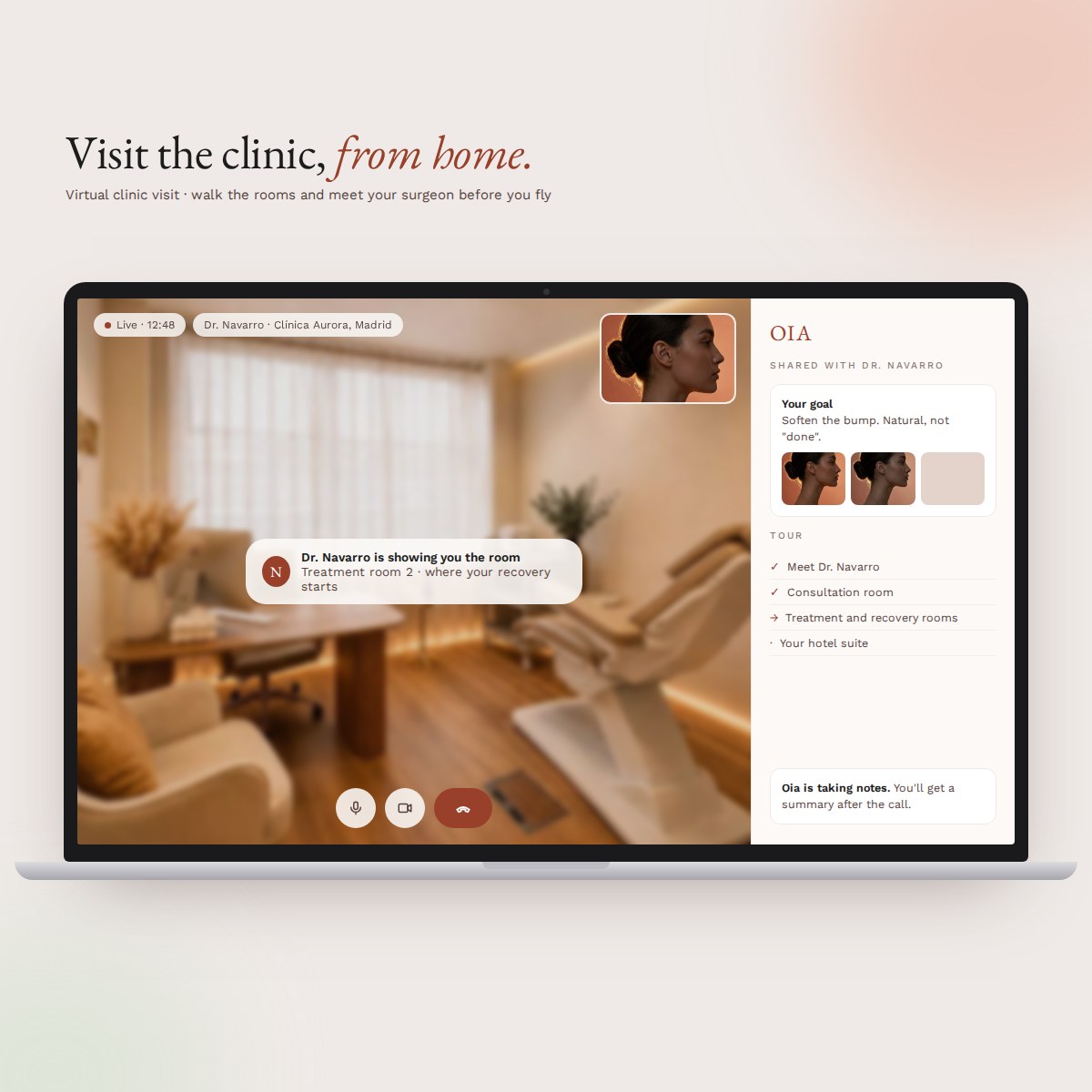 Concept: virtual clinic visit
Every fertility story is a journey, and women know this better than anyone. Most begin it alone, late at night, with a search bar and a lot of questions. I set out to understand that journey before designing anything for it.
women going through IVF interviewed, alongside women planning to freeze eggs or embryos
verified clinics worldwide in one search, with the true all-in pricejourneyfertility.com
at journeyfertility.com
Women's health is underfunded and under-researched, and fertility is where that gap is felt most. Women make some of the most expensive, life-shaping decisions they will ever make with very little clear information.
Prices swing between clinics and countries, the real total hides behind a "from" price, and every route, from a hormone test to IVF, sits in its own corner of the web. So the research happens at midnight: forums, pushy discovery calls, half-finished spreadsheets.
I spoke with 53 women going through IVF, and with women planning to freeze their eggs or embryos: different ages, lifestyles, decisions and reasons. I listened to how each of them started looking, where they got stuck, and what finally made them trust an answer.
I watched how people used early versions of the search, mapped the route from first worry to first booking, and took clinic prices apart into the medication, scans and storage fees that only appear at the end.
Start from where she is, not from what clinics sell. The search opens with one plain, human question, "where are you right now?", then shows every option side by side with the true all-in cost, at home or abroad, before she ever picks up the phone.
One calm search instead of ten anxious browser tabs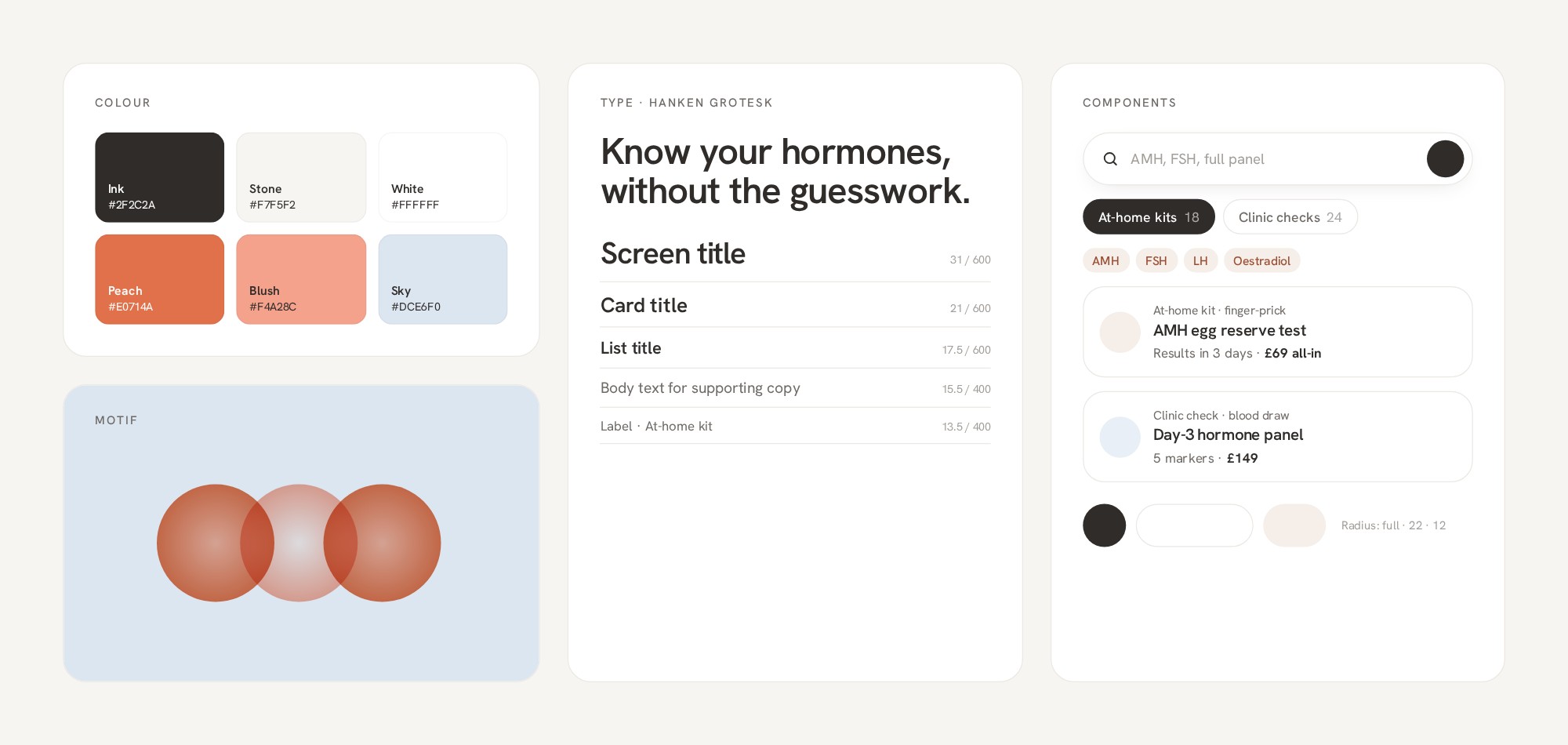 A warm brand in a category that feels clinical
Doctors see women's symptoms in pieces, one specialty at a time. Agatha gives her a one-minute daily voice log that becomes one timeline she can take to her GP.
scope refocused on the daily log and GP summary after research
structured research with EDS patients before a closed beta
The pattern was in the data all along. Nobody held the whole timeline.
What it changed: the product is the daily log and the GP summary. Research comes later, and only by choice.
What I got wrong: my first prototype led with community research. I restarted with the daily log first. Next: structured research with EDS patients before a closed beta.
Concept screens after the restart: log by voice, see the pattern, test your own idea, take it to your GP · illustrative dataA family members' club for Chiltern families, set on a 1712 estate in Chesham Old Town. Instead of designing it and selling it, I'm designing it with the families who will use it, and their answers have reshaped the plan.
founding places claimed before there was anything to seeSource: founding families letter
families registered, September to October 2026
pillars, synthesised from families' answers, now shaping every space
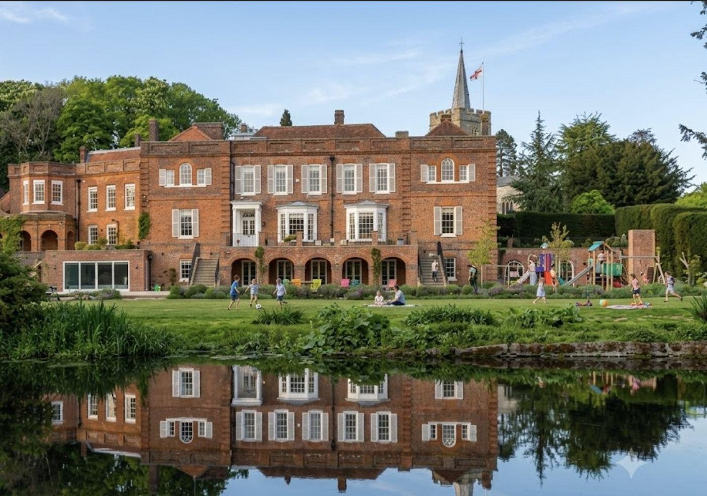 Concept render · The Bury, from across its lake
The more we listened, the clearer it became: we didn't need a longer list of rooms. We needed a philosophy strong enough to shape every space.
What it changed: the whole club is now organised under four pillars, calm, curiosity, creativity and courage, and every space has to earn its place under one of them.
Family clubs are usually planned around facilities: a pool, a gym, a soft play. Parents' weeks are planned around everything else: school runs, work, childcare and the gaps between them. Most local options split the family up.
The question was what a club would look like if it started from a family's real week, and whether enough families would commit to it before there was anything to see.
I tested the proposition before building anything. I approached 400 local families, screened for children under 12, and offered 100 founding places. Then I kept the founding families in the design process rather than treating them as customers:
The library became the connective tissue of the house: quiet, chatty and playful corners side by side, two heights everywhere so a child can reach what a child may touch, and sightlines instead of walls so a child can always find a parent's face.
App concept · one family's week, booking for everyone, and the swap shop
Scroll the screen to see a whole family's day
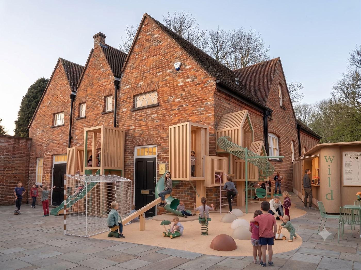 Concept render · The Stables and crash gym
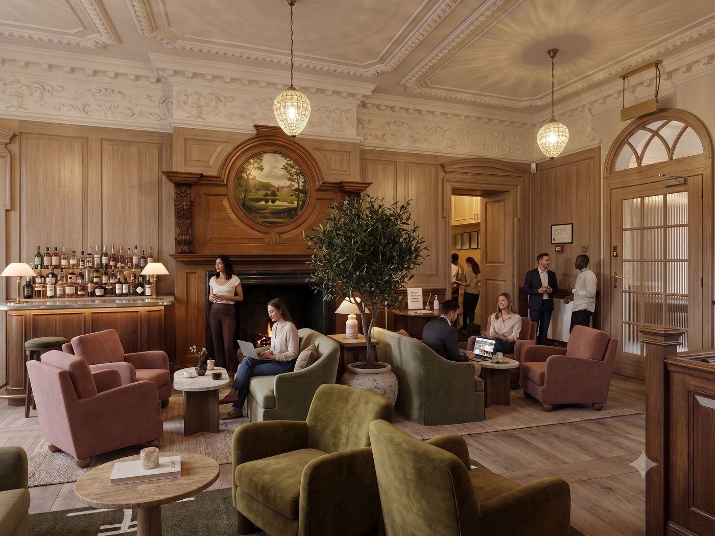 Concept render · The Drawing Room and co-working
What changed along the way: after a fire at the main house, we had to start again from the ground up. Rather than rebuild the old plan, I used it to step back and give the club a philosophy, shaped by what families had told us.
My mum has Parkinson's and needs to move more every day. A game she used to love turned out to be the way in. This is how one game for one person became four, and the start of a support site for others like her.
movement games built, each around a different exercisePlay Glimmer
a planned non-profit for people with Parkinson's and carers, UK and Turkey
Exercise felt like a chore. A game she already loved felt like hers.
What it changed: hide the exercise inside the game, not the other way round.
My mum is very immobile. She needs to move every day, but the exercises are repetitive, and on a hard day they're the first thing to go.
Research with a sample of one. I watched her daily exercises to see which movements she could manage and which she skipped. She used to love Bejeweled-style games, so I built on that memory instead of asking her to form a new habit. In the first game, Glimmer, you open your hand over a gem, then close it to grab.
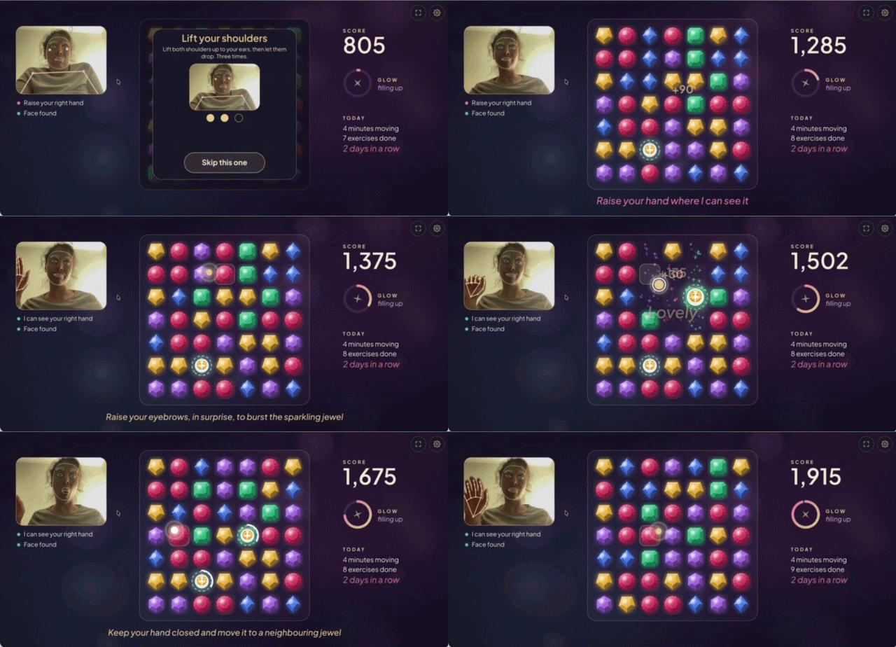
Each one takes on a different movement. All run in a normal browser with a webcam, in English and Turkish, and the camera picture never leaves the computer.
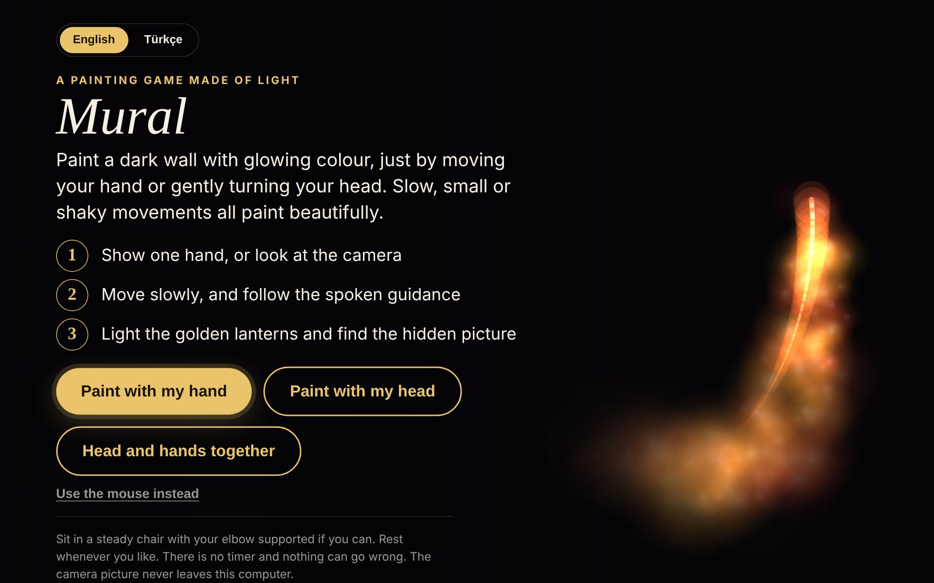 Mural · paint with your hand or head · mural.magnaven.com
Slow, small or shaky movements all paint beautifully. No timer, nothing can go wrong.
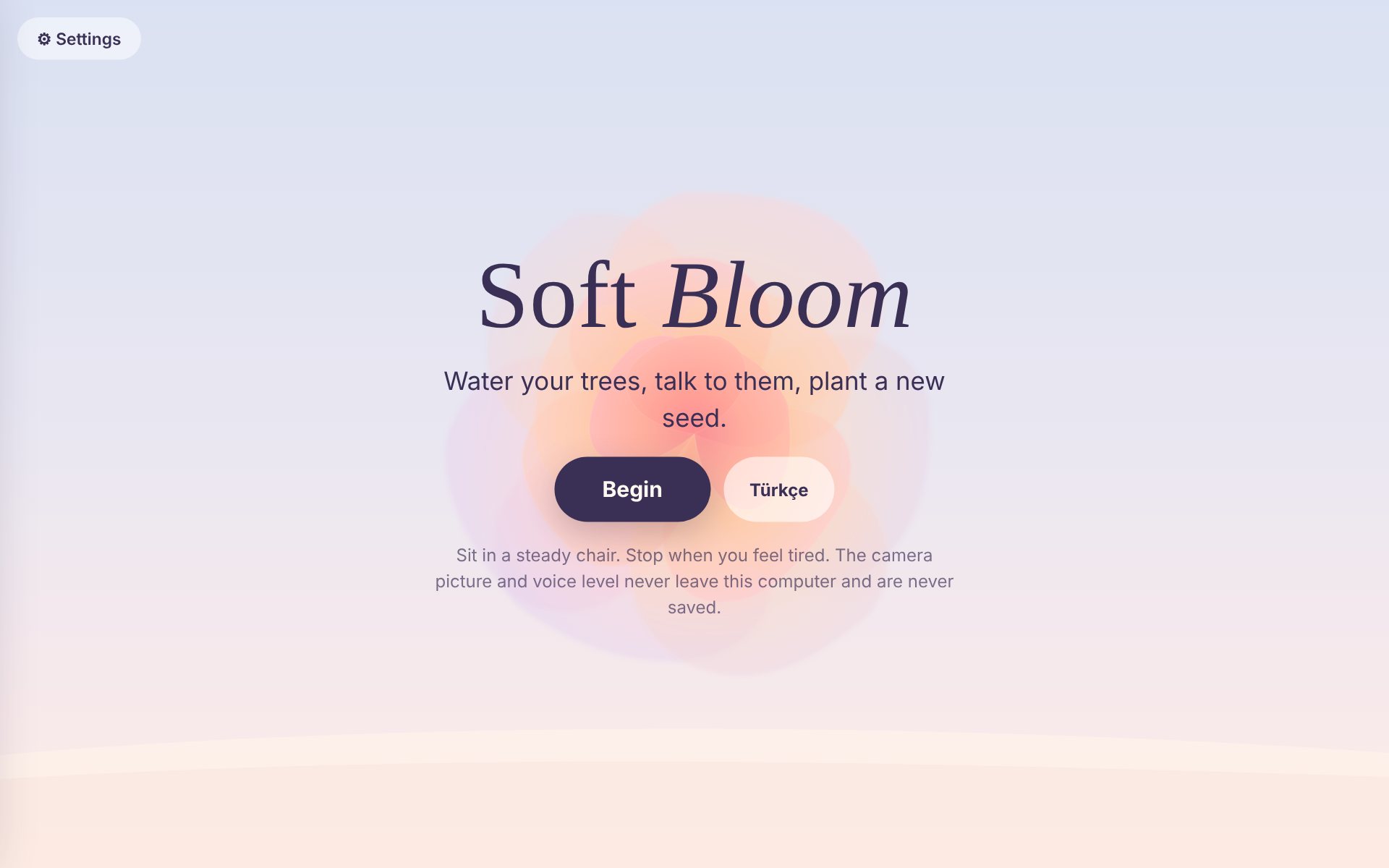 Soft Bloom · arms up and out · bloom.magnaven.com
Gentle arm raises water a garden, with breathing and voice built in.
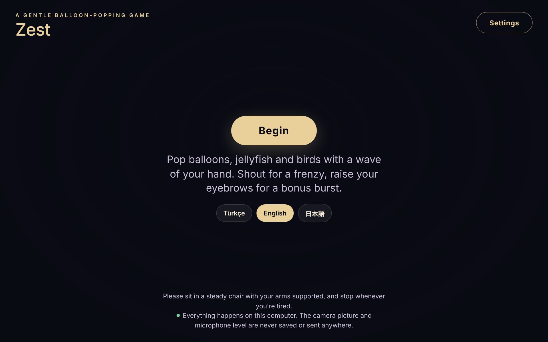 Zest · wave, shout, raise your eyebrows · zest.magnaven.com
Hand waves, voice and facial movement, in short, lively bursts.
Four games and the start of PDkin, a planned non-profit for people with Parkinson's and their carers in the UK and Turkey.
What I learned: designing for one person forces you to be specific. Every choice had to fit her hands, her energy and her memories, and that is what made it useful to others.
How do people keep moving forward when the odds, the statistics and the people around them say they won't?
I'm researching that question alongside my work. I see two kinds of courage. One says "if they did it, I can too". The other keeps going against the odds without following everyone else: not giving up, resting when tired, then carrying on.
Building for my mum taught me the second kind. It's also how I design: for the people on the edges of the data, who need a reason to keep going more than a perfect average.
Most founders never properly define their early adopters, so they build for whoever is willing to talk. Magpie is my research method for finding the people who need a product now, interviewing them well, and turning them into its first advocates.
as a research service for start-ups and scale-upsmagpie.magnaven.com
early adopter interviews in a four-week study
outputs a team can act on: a scored shortlist, tagged transcripts, a priority report and an advocate plan
magpie.magnaven.comEarly teams hear from whoever replies first, not from the people who need the product most. Focus groups add noise, and polite feedback hides the real need. Getting this wrong can cost a whole funding round.
I grounded the method in forty years of innovation research, from Rogers' diffusion of innovations to lead-user studies, and in my own work at Connectd and Oia. Then I turned the way I run research into four repeatable stages, with an AI interviewer doing the part that doesn't scale.
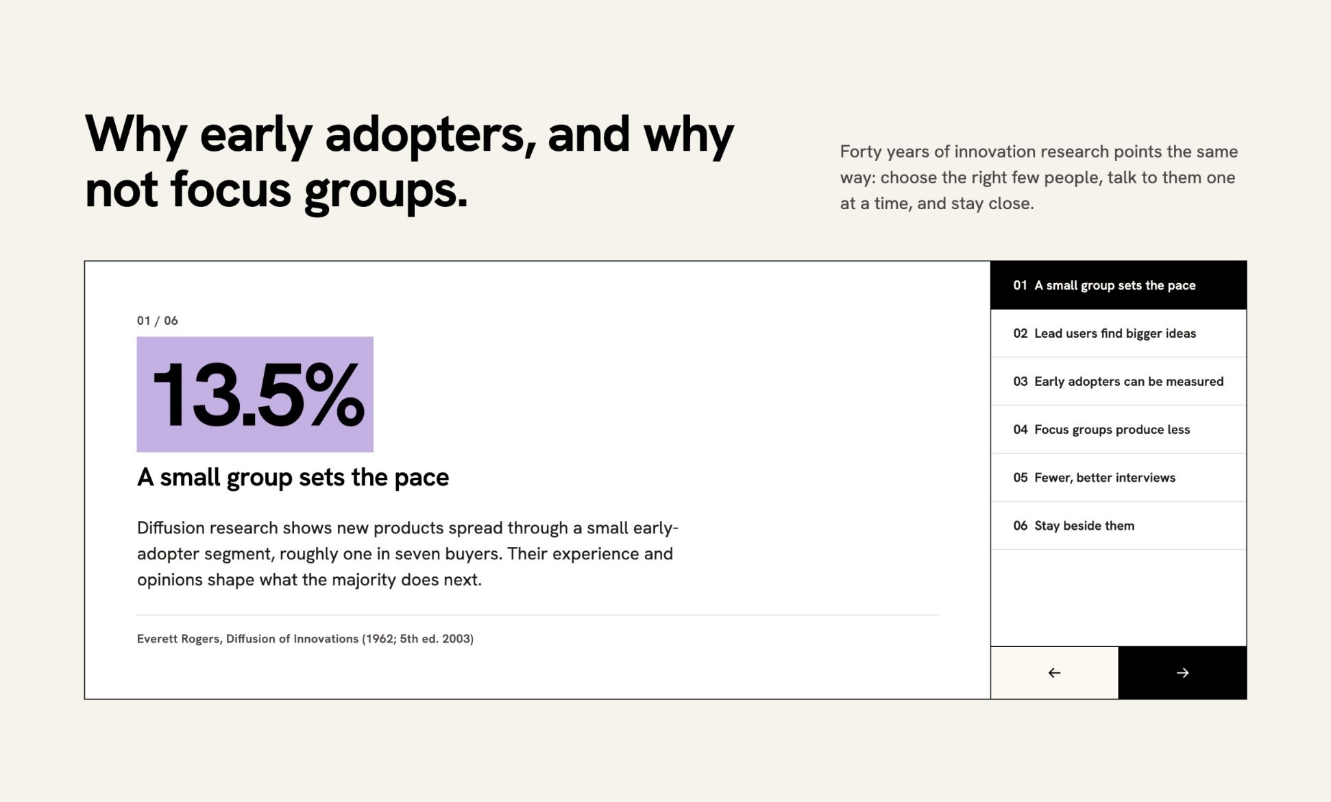 The evidence behind the method
Pair a clear human method with a trained AI interviewer that builds a profile of each early adopter, checks in at every iteration, and digs past the "faster horses" answer. It always discloses that it is AI, and nobody is quoted or named without consent.
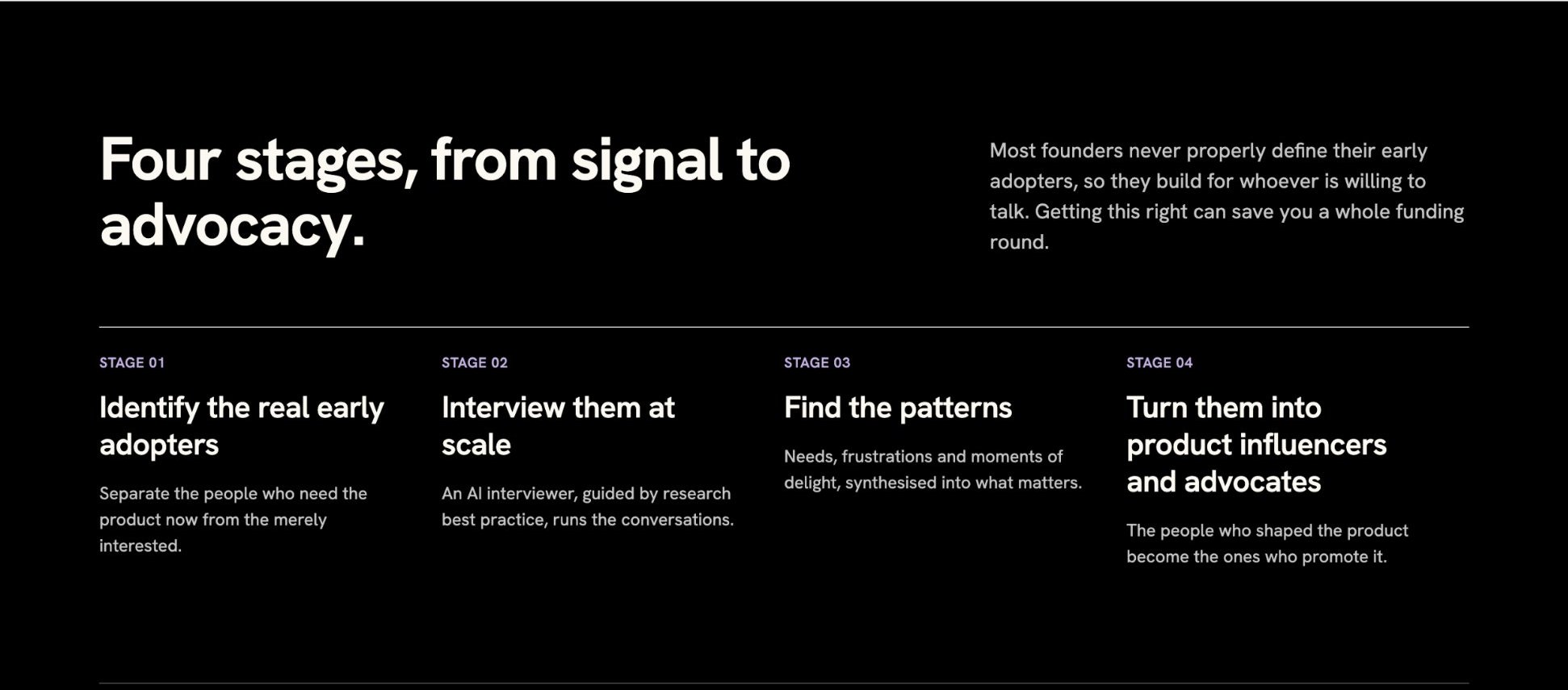 Four stages, from signal to advocacy
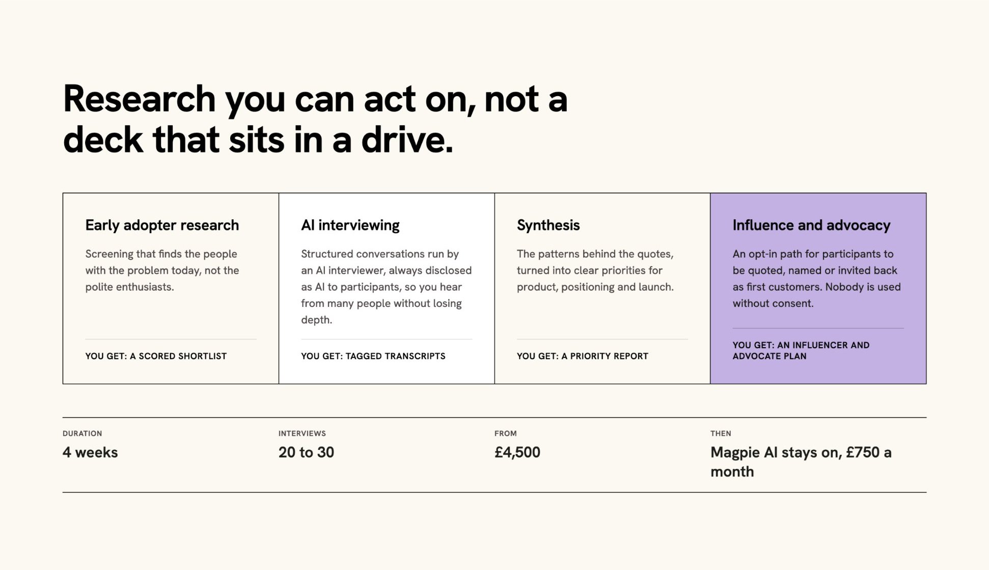 Research a team can act on, not a deck that sits in a drive
A voice journal with no typing. Letterbird calls once a day at a time you choose, asks up to three gentle questions, and keeps what you say as a page. I designed the UI and the motion kit for the Letterbird team.
users in an invite-only MVP
of users active every day
Journaling apps ask you to sit down and write, and most people stop within a week.
Take the writing away. One call a day asks the questions and turns your answers into a page, in your own words, not a transcript. If you miss it, it tries once more, then lets the day go.
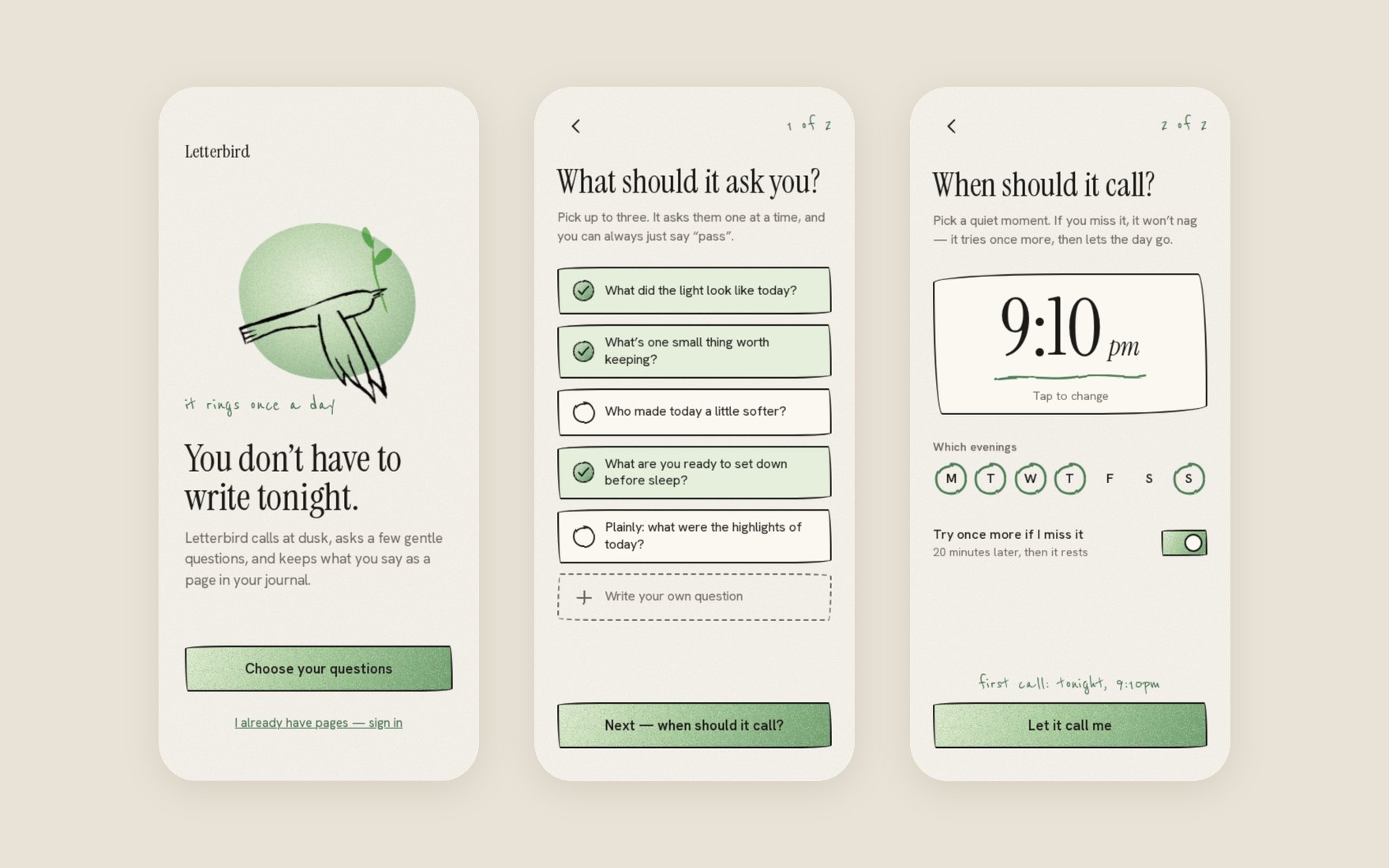 Setup in three screensThe callA calendar that fills as you pick up
 Motion carries the state: ringing, listening, writing, saved
 Your words, kept as pages
I talk to the people a product is for, try to understand what matters to them, and help teams make sense of what they've learned and decide what to build next.
I have a neurodivergent mind that's naturally drawn to patterns. It moves between a founder's frustration, a woman's midnight spreadsheet of fertility clinics and a parent's Saturday (these are some recent user profiles I spent time with), looking for the things that connect them. That's often where my work begins.
I've worked across health tech, fintech, AI and family products, with teams ranging from VCCP and Fidelity to early-stage start-ups. I've also built ventures of my own, starting with Tinkfabrik, a co-creation platform for sustainability that was runner-up at the MIT Business Plan Competition. Being a founder changed how I think about research. It's not just about gathering insights; it's about helping people make difficult decisions with a little more clarity.
Alongside my design work, I'm interested in curiosity, creativity and courage: what keeps people going when things get difficult, and how we learn to trust AI without losing trust in ourselves. These interests go back to being a creative kid who didn't quite fit in at school. They still influence how I approach design, particularly when working with people whose experiences aren't always reflected in the data.
I've lived and worked in London, Barcelona, San Francisco and Istanbul, and enjoy sharing what I learn through teaching. Most recently, I led a Design Research with AI workshop at NABA Milan.
idatinker@gmail.com · LinkedIn
Real voices in the room. I bring the people we're designing for into every conversation, in their own words, so decisions are argued from evidence, not opinion.
Safe to say what you see. Synthesis works when everyone can share a half-formed thought. I make room for contradictions and quiet voices.
Leave aligned. Research needs a recommendation. At Connectd, one clear recommendation took the product from three sides to two.